
Control View
Build-your-own control screens, global and project pages, listen/action binding.
Guides: Make a button for any REAPER action, custom action or script · Add a loudness and metering page to Control View · Move, line up and resize controls on a page · Change a control's type, label, colour and value readout · Group controls into a labelled section · Add a track level meter or a gain-reduction meter · Make a layout fit a phone, a tablet and both orientations · Make fine adjustments with Fine mode and focus zoom · Re-bind a control to a different parameter or track · Add, rename, reorder and share Control View pages across projects · Put plugin parameters from several tracks on one Control View page · Listen mode doesn't pick up a parameter or action · Build your own control surfaces
Add a new control page#
UnlockStart a brand-new blank canvas for a fresh set of controls, e.g. one page per song section, per workflow, or per FoH task.
How to use
- Open Control View.
- Tap the + at the end of the page rail.
- Choose Blank page.
- The new page is created project-scoped and selected automatically.
Tips
- New pages default to Project scope. Promote to Global later from page settings if you want it to follow every project.
Promote or demote a page between global and project#
UnlockDecide whether a control page lives in just this project or follows you into every project. Flip the Scope switch in page settings to promote or demote it.
How to use
- Long-press the page rail to enter its local edit mode.
- Tap the page you want to change.
- In Scope, switch between Project and Global.
- Tap Save.
Tips
- Promoting keeps each control’s plugin binding pinned to THIS project via a per-project overlay; demoting bakes those bindings back into the page. Global pages show a small globe badge on the rail.
Give a page a memorable name and a color so it's easy to spot in the rail.
How to use
- Long-press the page rail to enter its local edit mode.
- Tap the page you want to edit.
- Type a new name and/or pick a color swatch.
- Tap Save.
Put your most-used pages first by dragging them into a new order in the rail.
How to use
- Long-press the page rail to enter its local edit mode.
- Drag a page tile to its new position.
- Tap Done to exit the rail’s edit mode.
Tips
- Reordering only works within the same scope group. Global pages always sort before project pages.
Remove a page you no longer need, including all its sections and controls.
How to use
- Long-press the page rail to enter its local edit mode.
- Tap the × badge on the page.
- Confirm Delete.
Tips
- Deleting the last remaining page drops you back to the first-launch empty canvas. You can always add a new one.
Enter and exit page-edit mode#
UnlockOpen a modal editing session on the current page so you can add, move, and configure controls, then save or discard your changes as a batch.
How to use
- Tap Edit in the top bar.
- Make your changes: add sections/controls, drag them around, open their settings.
- Tap Done to save, or Cancel to discard everything from this session.
Tips
- Page switching and adding a new page are locked while editing, so you can’t lose your place mid-edit.
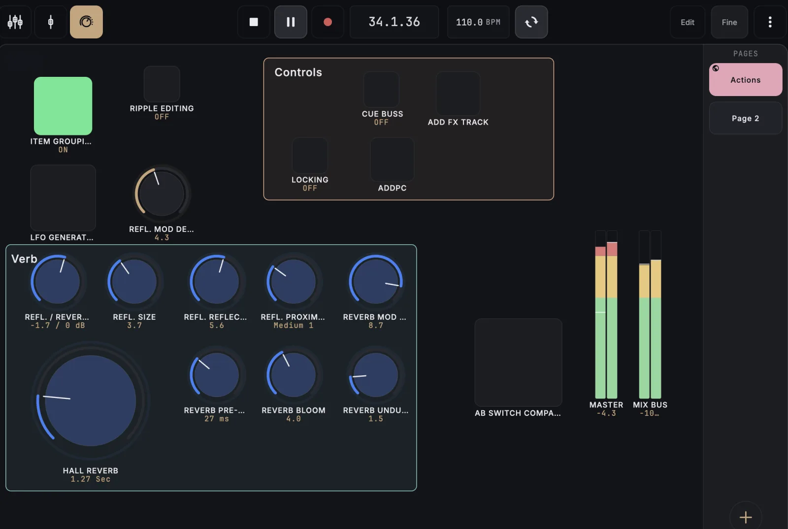
Arrange controls exactly where they'll appear#
UnlockEdit mode shows the same pages you'll perform on, so what you arrange is what you get: a control never jumps to a different page when you tap Done.
How to use
- Enter edit mode on any page.
- Arrange controls where you want them; the pages you see while editing are exactly the pages you’ll perform on.
- Tap Done. Nothing shifts to a different page behind your back.
Tips
- Just looking? Opening edit mode and tapping Done without changing anything saves nothing; your layout is left exactly as it was.
- Because pages fit the current device, editing on a smaller screen can show more pages than a larger one, but each control still lands where you place it.
The fastest way to build a page, start a listen session, then physically move any plugin parameter in REAPER and a matching knob appears on the iPad automatically, one per touch.
How to use
- In edit mode, tap + Add (page-level) or a section’s own + button.
- Choose From listen.
- In REAPER, touch or move any FX parameter. A knob is added instantly.
- Repeat for as many parameters as you want.
- Tap Done to keep them, or Cancel to discard the whole batch.
Tips
- You can bind parameters from different tracks and plugins in the same session. One page can mix controls across your whole mix. Cancelling after adding more than 3 asks you to confirm the discard.
- Touching a parameter that is already bound in the section you are adding to is skipped, and the app names the control that already carries it. A capture that goes nowhere never looks like a dead listen mode.
- The listen sheet does not block the iPad while it is up, and leaving edit mode with Done or Cancel ends the session too.
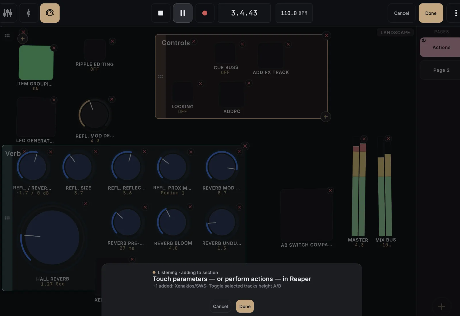
Put a REAPER action, menu item, SWS command, custom action or ReaScript on a button just by doing it once, from the Main section or from the MIDI editor. The app captures which action ran, which section it lives in, and whether it's a toggle or a one-shot.
How to use
- On a global or project Control View page (not a plugin template), enter edit mode.
- Tap the + in a group and choose From listen.
- In REAPER, run the action/command you want.
- A button appears already wired: momentary for a one-shot action, a lit toggle when REAPER reports a real on/off state.
- Tap Done.
Tips
- Toggle buttons keep reflecting REAPER’s live state afterward, e.g. the button lights up when Loop is turned on from the REAPER transport, not just from the iPad. Action capture and parameter capture can happen in the same listen session.
- Actions are a Control View feature. Run one during a plugin-template listen session and the app tells you rather than swallowing it.
- Performing an action that already has a button in the section you are adding to is skipped, and the app names the button that already carries it rather than silently doing nothing. Sections are checked one at a time, so the same action can still be placed in a different section on purpose.
- Custom actions and ReaScripts bind to themselves, not to the first native action inside them.
- If you type an action id by hand in the button settings, the app checks that the id really exists in the section you picked and tells you if it does not, instead of firing whatever else REAPER keeps at that number. It cannot catch the opposite mistake: an id that is valid in both sections runs the one you asked for, not the one you meant.
- MIDI editor actions work too: open the MIDI editor during the listen session and perform the action there. The button remembers that it belongs to the MIDI editor, so it runs the right thing even though REAPER reuses the same command numbers in both places. Tap it with no MIDI editor open and the app says so rather than doing nothing.
- Perform an action in REAPER’s inline MIDI editor and the app tells you to open the full MIDI editor and do it there instead. Most inline actions live in the MIDI editor’s own section too, so that is usually all it takes.
- REAPER’s remaining sections, the Media Explorer and the crossfade editor, cannot be triggered from outside REAPER at all, by any control surface. Perform one during a listen session and the app names the section and stops, instead of binding a button that would never work. The way around it is REAPER’s: wrap the action in a ReaScript registered in the Main section, then bind that.
- REAPER identifies custom actions and ReaScripts per install, not globally. Share a page carrying one and the button will not resolve on the other machine: tapping it warns you instead of doing nothing. Action buttons cannot be re-bound, so delete the button there and perform the action again to learn it on that machine. Native and SWS actions travel fine.
Add level meters from tracks#
UnlockDrop one or more vertical level meters for any tracks in your project, in bulk. The Master bus is a pickable track too.
How to use
- In edit mode, tap + Add and choose Meter from track…
- Check off every track you want a meter for. Master is listed alongside the regular tracks.
- Tap Add N meter(s).
Tips
- Meter cells are narrow, so a long track name is shown in full. It’s centered and allowed to spill past the cell rather than being cut off with an ellipsis.
- A meter bound to Master keeps working across REAPER restarts and project reloads. MixSurface re-finds the master bus itself instead of trusting a saved ID that changes between sessions.
Re-bind a meter to a different track#
UnlockPoint an existing level meter at a different track without deleting and re-adding it, opens the same track picker used when adding a meter.
How to use
- Tap the meter in edit mode to open its settings.
- Tap Re-bind… in the Bound to card.
- Pick the new track, Master included, from the list.
- Tap Add to confirm.
Tips
- This is the same track picker used when adding a new meter. Re-binding never needs listen mode or touching anything in REAPER.
Drop a live gain-reduction readout for any compressor onto your page. Just touch any control on that plugin once to bind it.
How to use
- In edit mode, tap + Add and choose GR Meter.
- Touch any control on the target compressor in REAPER.
- Tap Add to confirm.
Tips
- Only works on compressors that report a gain-reduction value to REAPER, true for most VST/VST3/AU compressors, generally not for JSFX.
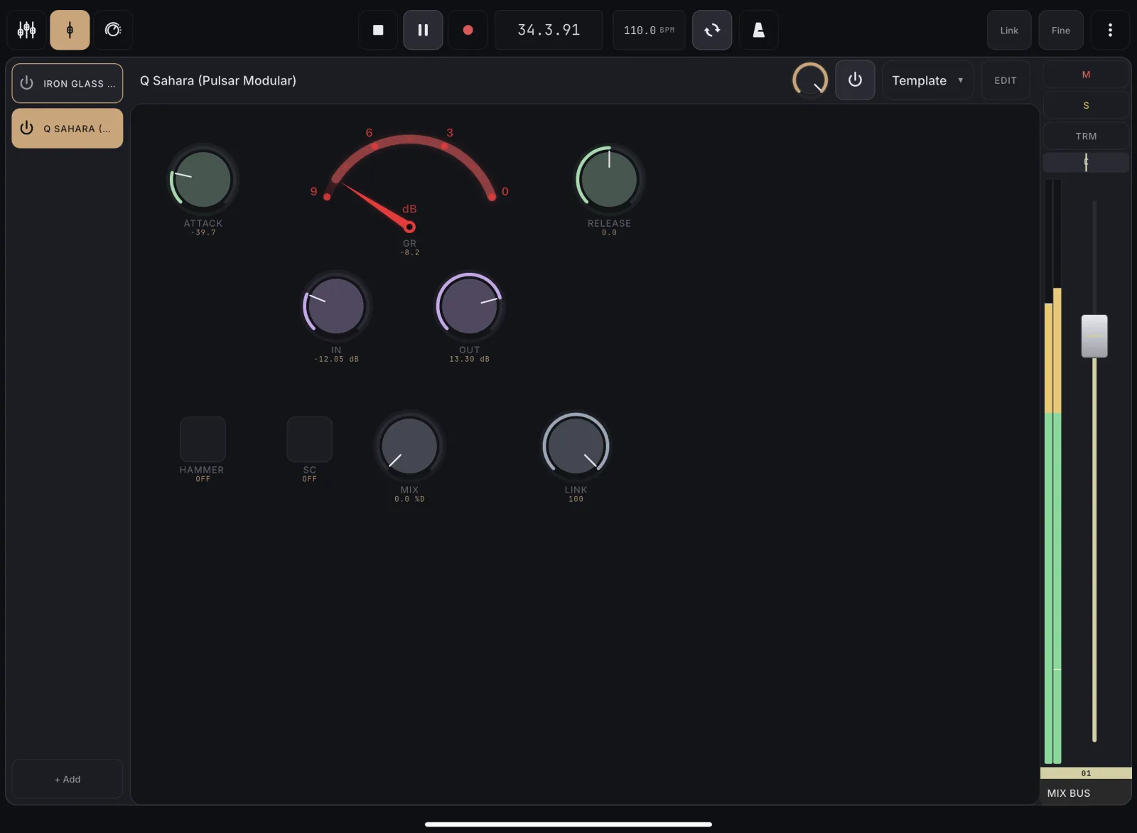
Configure a GR meter's look#
UnlockChoose how a gain-reduction meter displays (a moving line, a bar, or an analog-style needle arc) and set its scale and tick marks.
How to use
- Tap a GR meter control in edit mode.
- Pick a Style: Line, Bar, or Arc.
- For Line/Bar, choose Vertical or Horizontal orientation.
- Set the Range (full-scale reduction) and toggle Show ticks.
- Tap Save.
Tips
- The needle arc has no orientation toggle. It’s always the arc shape.
Add a static text label#
UnlockDrop a plain text caption onto the page to title a section or add context, purely decorative, with no binding.
How to use
- In edit mode, tap + Add and choose Static label.
- Its settings sheet opens automatically. Type your text.
- Tap Save.
Move any control, grouped or ungrouped, to a new spot on the page; overlapping controls automatically shuffle out of the way.
How to use
- In edit mode, press and drag a control.
- Drop it in an empty spot, or over other controls to push them aside.
- Everything snaps to an 8px grid.
Tips
- A section’s area is occupied space too. A control can’t drop onto, or be shuffled into, a section it doesn’t belong to.
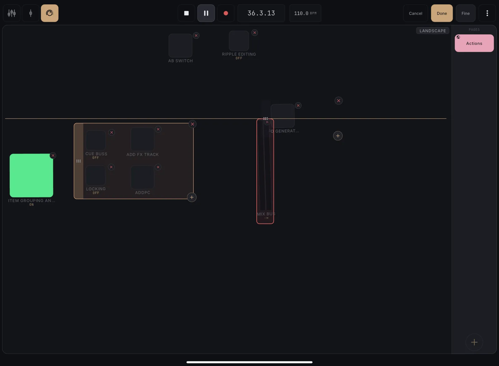
Drag a control to the left or right screen edge and hold. The canvas flips to the neighbouring page mid-drag so you can drop it there, iOS-home-screen style.
How to use
- In edit mode, press and drag a control.
- Hold it against the left or right edge of the screen.
- The canvas flips to the next page; drop the control where you want it.
Tips
- It’s the same move whether you’re editing a Control View page or a plugin template.
- Dropping onto an occupied spot follows your collision preference (place-and-block, or shove aside). See “Choose what happens when controls collide”.
Resize a control#
UnlockPick a larger or smaller footprint for a control so it fits your layout and is easy to hit. Growing it keeps everything on the current page whenever there's room.
How to use
- Tap a control in edit mode.
- In Slot size, pick a size option.
- Tap Save.
Tips
- Growing a control stays on its current page whenever there’s room. It only spills onto the next page when the page is genuinely full.
Set a control's accent color#
UnlockTint an individual knob, fader, segmented, dropdown, or button so it stands out or matches a section's theme.
How to use
- Tap the control in edit mode.
- Pick a swatch from Color (Active color for a button).
- Tap Save.
Tips
- The chosen color carries across a type morph. Switching a colored knob to a fader keeps its tint.
- The first swatch is Default. It shows the app’s own accent color, which is exactly what the control renders when you leave it uncolored.
- A button also has a separate Inactive color for its OFF state.
Set a button's inactive color#
UnlockGive a button's OFF state a color of its own instead of the neutral grey box, so a row of buttons reads at a glance even when nothing is lit.
How to use
- Tap a button in edit mode.
- Pick a swatch under Inactive color.
- Tap Save.
Tips
- Leave it on Default to keep the plain grey resting box, which is what every button looked like before.
- Pair it with Active color to give a button two readable states, for example a dim slate at rest and a bright red when lit.
Invert a button that reads backwards#
UnlockFix a button that lights up when the plugin is off. Some plugins report an engaged control as 0 and a disengaged one as 1. Invert flips both what the button shows and what a press sends.
How to use
- Tap a button in edit mode.
- Set Invert to “On”.
- Tap Save.
Tips
- Reach for this when a button looks lit while the plugin’s own window shows the control switched off, and dark when it is on.
- It flips the press as well as the lamp, so the button keeps doing the right thing in REAPER.
- The small value line under the button still shows the plugin’s own wording, so it can read “Off” under a lit button. That is the plugin describing its own raw value.
- Leave it “Off” for every button that already behaves, which is almost all of them.
Keep a button label in mixed case#
UnlockShow a button's name exactly as you typed it instead of forcing it to capitals, for labels like Talkback or Mix Bus that read better in mixed case.
How to use
- Tap a button in edit mode.
- Set Label case to “As typed”.
- Tap Save.
Tips
- The default, “Upper”, is what every button has always done, so leaving it alone changes nothing.
- On the default label placement (name beneath the button) the label is a single line, so a long name is trimmed rather than wrapped.
- On the inline placement (name inside the button) the button keeps its chosen size and the name wraps to fit it instead, shrinking a step or two if it has to.
- A very long name on a small inline button can still be cut off with an ellipsis. There is a floor on how small the text will go, so it stays readable from a distance. Pick a bigger button size, or a shorter name, if you need the whole thing visible.
Narrow a knob or fader's travel range#
UnlockRestrict a knob or fader to only sweep part of the underlying parameter, e.g. lock a send knob to the top half of its range.
How to use
- Tap the knob or fader in edit mode.
- Set Min and Max (normalized 0.0–1.0).
- Tap Save.
In edit mode the whole canvas is the button. Tap any empty area to open the Add menu, no toolbar affordance to hunt for.
How to use
- Enter edit mode.
- Tap any empty area of the canvas.
- Choose what to add from the menu that opens.
Tips
- Tapping an existing control selects or moves it instead. Only empty space opens the Add menu.
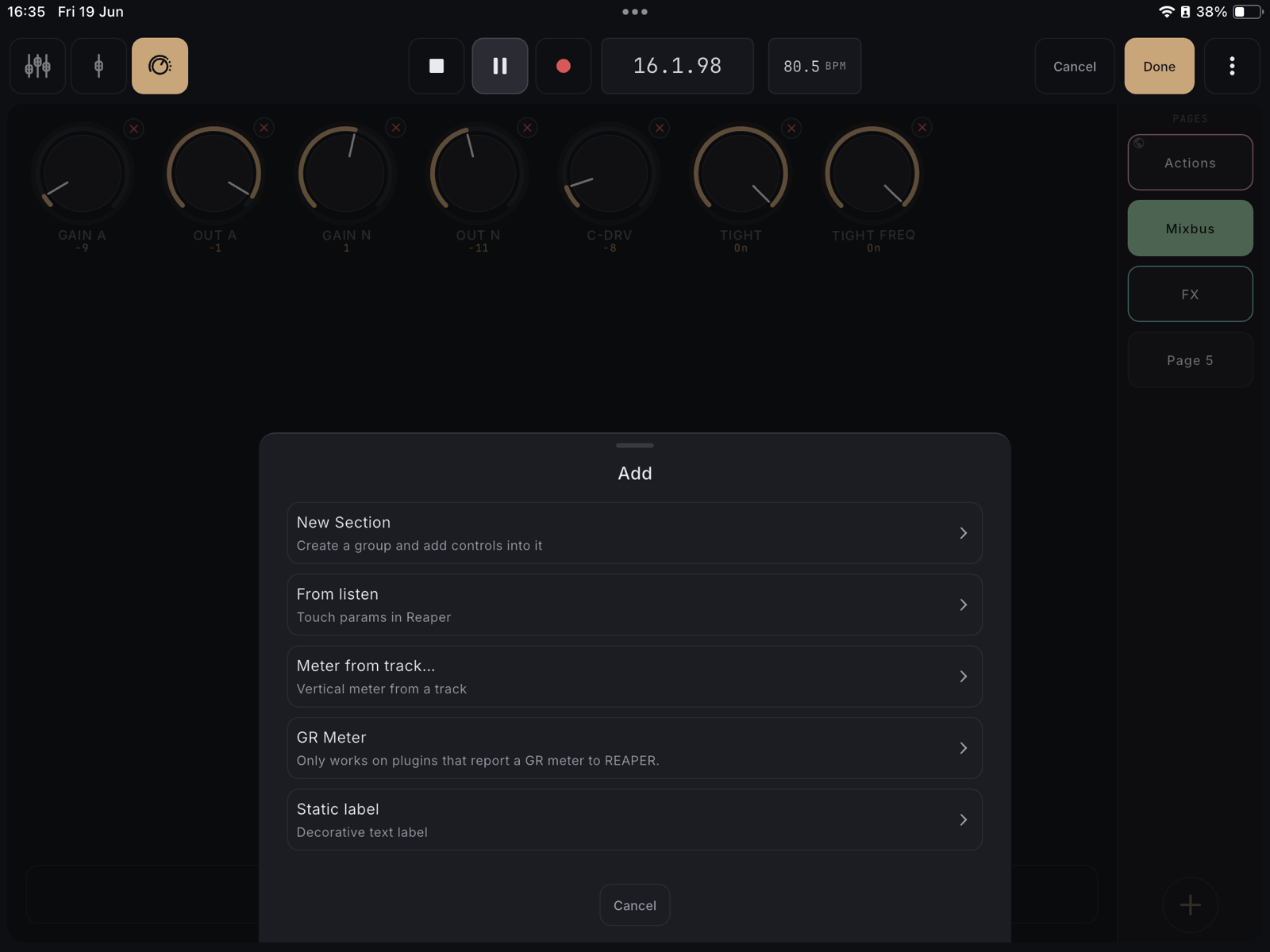
Group controls into a labeled section#
UnlockCreate a colored, labeled box to visually cluster related controls, e.g. one section per plugin, or one per task.
How to use
- In edit mode, tap an empty spot on the canvas.
- Choose New Section.
- Name it and pick a color in the settings sheet that opens.
- Tap Save.
Tips
- A new section starts empty. Add controls into it next with its own + button, or with the page-level Add sheet.
Move a control into or out of a section#
UnlockReassign an existing control's section membership. Pull it into a group, or drop it back onto the page as ungrouped.
How to use
- Tap the control in edit mode to open its settings.
- In Group, pick None (ungrouped) or an existing section.
- Tap Save.
Reposition every control in a section together by dragging its header strip, instead of moving each control one at a time. It collides like a real control and can carry across pages.
How to use
- In edit mode, long-press the header strip on the left edge of a section, then drag.
- Drop it in an empty spot. The section and every control inside it land together.
- Drag against the left or right screen edge and hold to carry the section onto another page, same as a single control.
Tips
- A section can’t drop onto space a control or another section already occupies, and vice versa. The target turns red and the section snaps back to where it started.
- Unlike dragging a single control, a section never shoves anything else out of the way to make room. The drop only succeeds where there’s genuinely free space, no matter your collision setting.
Edit a section's name, color, and render style#
UnlockRename a section, recolor its hull, and choose whether it renders as a solid outlined container or a subtle color underlay behind its controls.
How to use
- In edit mode, tap a section’s header strip.
- Edit the label, pick Container or Underlay render style, and choose a color.
- Tap Save.
Remove a section's grouping. Its controls survive and become ungrouped, directly on the page.
How to use
- In edit mode, tap the × in the section’s top-right corner.
- Confirm Delete.
Change a control's type#
UnlockSwap a knob for a fader, button, segmented switch, or dropdown (and back) without losing its binding, handy when a bulk-add gives you a knob but the parameter really wants a toggle.
How to use
- Tap a control in edit mode to open its settings.
- In Type, pick Knob / Fader / Button / Segmented / Dropdown.
- Tap Save.
Tips
- Meters, GR meters, and labels are fixed (terminal) types. They don’t show a Type selector. To change one, delete it and add a new one.
Choose momentary or toggle for a button#
UnlockDecide whether a button fires only while held (momentary, e.g. talkback) or flips on/off and stays lit (toggle, e.g. mute).
How to use
- Tap a button in edit mode.
- Set Button mode to Momentary or Toggle.
- Tap Save.
Add a center detent to a fader#
UnlockTurn on a snap-to-center notch for a bipolar fader (pan-style controls) so the center point is easy to find by feel.
How to use
- Tap a fader in edit mode.
- Switch Center detent to On.
- Tap Save.
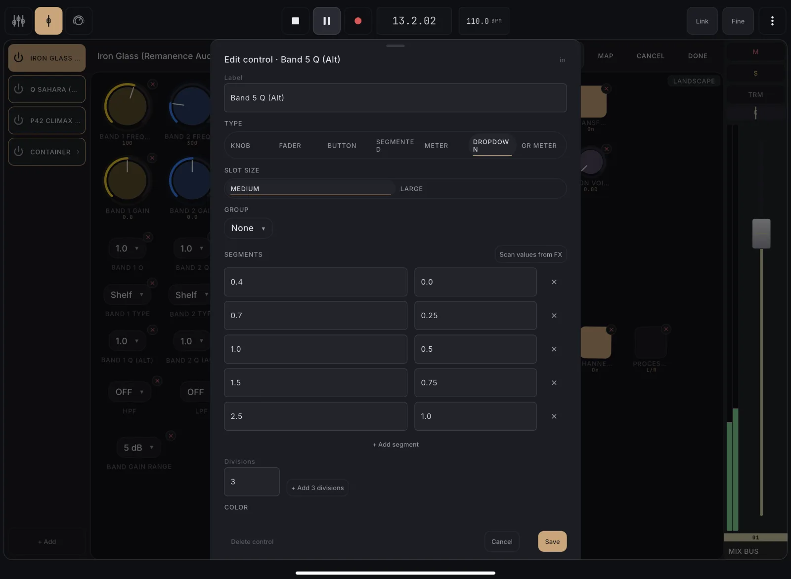
Edit a segmented or dropdown control's options#
UnlockHand-author the labeled steps a segmented switch or dropdown shows, when you want custom names instead of the plugin's own text.
How to use
- Tap a segmented or dropdown control in edit mode.
- Edit each row’s label and value, or tap + Add segment for a new row.
- Tap Save.
Auto-generate evenly-spaced steps#
UnlockSkip hand-typing rows. Generate N evenly-spaced divisions (e.g. 4 quarter-steps) for a segmented or dropdown control in one tap.
How to use
- Open a segmented or dropdown control’s settings.
- Type the number of divisions you want (2–32) in the count field.
- Tap + Add [N] divisions. This replaces the current rows.
Choose what happens when controls collide#
UnlockDecide whether dropping a control onto an occupied spot places it (blocking the drop) or shoves the control underneath out of the way, a global editing preference.
How to use
- Open Settings and tap Control View.
- Find Reorder on collision and choose Off or On.
- Off (the default): dropping a control onto an occupied spot is blocked. The target turns red and the control snaps back. Nothing else moves.
- On: the control already there reflows into the nearest free spot to make room.
- The choice applies everywhere you arrange controls, both Control View pages and plugin templates.
Tips
- Leave it Off if you like placing controls precisely without a neighbour jumping out of the way.
- The setting is remembered on this device and never changes your saved layouts. It only affects the drag interaction.
- A section’s area counts as occupied space either way. A control can’t land on it, reflow or not. Dragging a whole section is different again: it never reflows anything, always blocking and snapping back on a collision. See “Move a whole section as one unit”.
Show or hide a control's value#
UnlockForce the live value number to show or hide on a knob, fader, or meter, useful when the automatic rule hides it on the smallest controls but you still want to read it.
How to use
- Open a knob, fader, or meter’s settings.
- Set Value readout to Auto, Show, or Hide.
- Auto shows the number on larger controls and hides it on the smallest ones; Show and Hide force it either way.
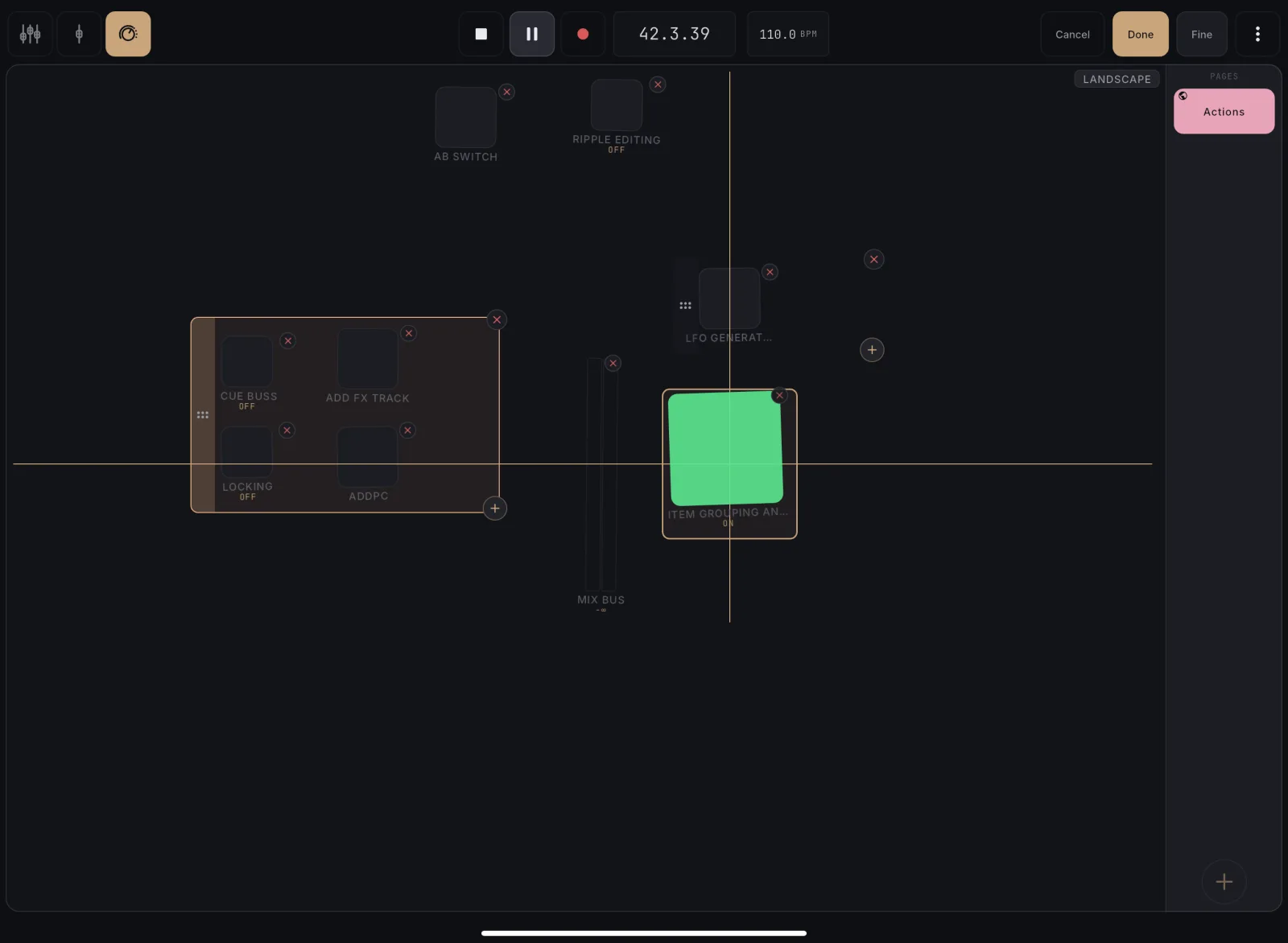
While dragging a control, snap-lines appear when its edges or center line up with a neighbour, so a tidy, aligned grid is easy to build by eye.
How to use
- In edit mode, drag a control.
- When its edge or center lines up with a nearby control, a guide line appears and the control gently snaps into alignment.
- Both axes work at once. Line up horizontally with one neighbour and vertically with another to drop straight into a grid.
Tips
- The pull is gentle. It only kicks in when you’re already close, so it never fights precise placement.
- Guides show the exact line you’re aligning to, so you can build an even layout without measuring.
Discover a segmented or dropdown control's labels by scanning the bound plugin parameter's own values, instead of typing them by hand, ideal for plugins that don't report their choices up front.
How to use
- Open a segmented or dropdown control that’s bound to a plugin parameter, in a plugin template or a Control View page.
- Tap Scan values from FX.
- MixSurface sweeps the parameter, reads back each distinct choice, and fills the rows. Its original value is restored when the scan finishes.
- Review the discovered labels and values, tweak if needed, then Save.
Tips
- Use this for plugins that hide their choices (many JUCE-style plugins, e.g. Valhalla, report mode parameters as continuous). The scan finds the options anyway.
- If the parameter isn’t really a list of choices (it’s continuous, or has more than 32 distinct values) the scan tells you it looks continuous and leaves your rows untouched.
- If the scan can’t run (the audio engine is off, or the parameter is being automated/modulated so the writes don’t stick), you’ll get a clear “couldn’t scan” message with the reason, instead of a misleading “looks continuous”.
- The scan never overwrites silently. It fills the editor for you to confirm before Save.
- The button appears for any plugin-parameter-bound dropdown or segmented control, in Channel Detail’s plugin editor or a Control View page alike (a live scan still needs a live plugin to sweep).
Point an already-placed control at a different plugin parameter, useful when a binding goes stale or you want to repurpose a control.
How to use
- Tap the control in edit mode to open its settings.
- Tap Re-bind… in the Bound to card.
- Touch the new parameter in REAPER.
- Tap Add to confirm.
Tips
- Leaving edit mode with Done or Cancel ends the re-bind session too, so the prompt never stays up over a page you have already closed.
- Action buttons cannot be re-bound. Re-bind listens for a plugin parameter, and an action is not one, so the button tells you instead of starting a session it cannot finish. To point a button at a different action, delete it and learn the new action.
Notice and fix a control that needs relearning#
UnlockWhen REAPER's plugin parameter order shifts (e.g. after a plugin update), a bound control can go stale. It dims and shows a broken-link glyph until you re-bind it.
How to use
- Look for a dimmed control with a small broken-link icon in the corner.
- Tap it to open its settings.
- Tap Re-bind… and touch the correct parameter in REAPER.
Tips
- This is for parameter controls. Action buttons cannot be re-bound: delete the button and perform the action again to learn it.
The same page works in portrait and landscape: controls repack to fit the new shape and stay upright and readable, with no sideways text.
How to use
- Build or open a page in either orientation.
- Rotate the iPad.
- The controls repack to fit the new shape automatically, with no rebuild and nothing turned on its side.
Tips
- Repacking keeps every control at a comfortable size and upright: a narrower screen uses more pages rather than shrinking or rotating anything.
- Want a specific layout for a screen size instead of the automatic fit? Arrange it yourself: see “Save a custom layout for this screen size”.
Remove a single control from the page, from its own × badge, or from its settings sheet.
How to use
- In edit mode, tap the × badge on the control (or open its settings and tap Delete control).
- Confirm Delete.
Instead of letting a page auto-fit, author its own layout for the size you are on: arrange the controls and MixSurface saves that layout keyed to this device width, separately from the layouts you saved on other sizes.
How to use
- Put the app on the device and orientation you want to design for (a phone, a tablet, portrait, a resized window on a Mac).
- Tap Edit. The pill in the edit bar shows the orientation and the current width, which is the size a save will store.
- Move and resize the controls for this size.
- Tap Done. This layout is saved just for this screen size; the layouts you saved on other sizes are untouched.
Tips
- Same controls, same bindings: only their positions and sizes differ between screen sizes. Add a control on one size and it appears (auto-placed) on every other size until you arrange it there too.
- A device with no saved layout of its own uses the closest saved layout at or below its width, then re-fits to its screen. Save once on that device to give it its own layout.
- Changed your mind? Tap “Reset to automatic layout” to drop the layout saved for this size and go back to automatic fitting. To prune layouts saved on other sizes, open the manage-sizes list (the settings icon by the pill).
Clear every control on a page in one tap, instead of deleting them one at a time. Each page tab carries its own ✕ while editing, so you can clear any page without navigating to it first. Works the same in Control View and in Channel Detail's plugin-template editor.
How to use
- Open a template for editing: a plugin template in Channel Detail, or a Control View page.
- The page tabs run in one scrollable row along the bottom; each tab shows a small ✕ while editing.
- Tap the ✕ on the tab of the page you want to clear (you don’t have to be on that page).
- Confirm Delete. Every control on that page, and any section it fully empties, is removed from the template on every device.
Tips
- A tab only shows its ✕ when that page actually has something to remove.
- After you clear the page you’re on, you land on the previous page (or the next one if you cleared the first).
- This clears content from the template itself, not just this device’s view of it.
- Clearing a page in the middle of a multi-page template removes its tab right away and renumbers the rest; the later pages keep their exact layout.
When a page was authored at a different size and MixSurface had to move controls to fit your screen, a small AUTO-FIT badge appears. Tap it to see the authored size and how to make the layout your own.
How to use
- Open a page whose layout was authored on a different screen size.
- If controls had to move to fit your screen, an AUTO-FIT badge shows in the top-right corner.
- Tap it. A message tells you the size the layout was authored at and that you can adjust it here.
Tips
- AUTO-FIT only appears when something actually moved to fit, not just because the sizes differ. A layout that already fits your screen shows no badge.
- To stop the auto-fit and pin a layout for this exact size, tap Edit, arrange the controls, and Done: see “Save a custom layout for this screen size”.
One tap gives you a page led by the super meter, with loudness history and true-peak band, spectrum, dynamic range, and a second page of loudness columns, spectrogram, stereo cloud, phase and VU, fed by the MixSurface Analyzer on your monitoring chain.
How to use
- In Control View, tap + at the bottom of the page rail.
- Choose From template, then Mastering metering.
- MixSurface adds the MixSurface Analyzer as the first plugin on your monitoring chain and opens the new page.
- Play your mix. Integrated loudness starts counting when playback starts.
Tips
- The page is global, so it is there in every project.
- Swipe to the second page for the spectrogram, stereo cloud, phase and VU.
- On iPhone the same meters are split across three pages.
- With no pages yet, the empty Control View offers Blank page and From template directly.
One tap gives you a page led by a large spectrum, with the stereo cloud, phase scope, VU pair and a super meter, and a second page with the spectrogram and loudness history.
How to use
- In Control View, tap + at the bottom of the page rail.
- Choose From template, then Mixing metering.
- Play your mix and watch the spectrum and the stereo cloud.
Tips
- Pinch the spectrum to zoom into a frequency range; double-tap to see 20 Hz to 20 kHz again.
- The page is global, so it is there in every project.
Read loudness and dynamics on one dial#
UnlockThe super meter shows short-term loudness against PSR on its outer ring, integrated loudness against PLR on its inner ring, and integrated loudness, true peak and PLR in the centre, coloured against your delivery target.
How to use
- In edit mode, add a meter and choose Super meter, or start from the Mastering metering template.
- Tap the super meter to open its settings and pick a delivery target.
- Tap Done and play your mix.
Tips
- The left half of each ring is loudness (minus 40 to 0 LUFS), the right half is PSR or PLR (0 to 20 dB). The two halves meet when loudness is near 0 LUFS and PSR is near 20 dB. A short PSR arc means a dense, squashed mix; a long one means plenty of headroom above the loudness.
- Long-press the dial to reset the measurement and start over.
- The target shows as a tick on the loudness half.
Read integrated, momentary and short-term loudness, true peak and LRA, coloured against a streaming or broadcast target, and restart the measurement with a long press.
How to use
- In edit mode, tap the loudness meter to open its settings.
- Pick a target: Spotify, Apple Music, YouTube, Amazon Music, EBU R128, ATSC A/85 or Custom.
- Tap Done and play your mix.
- The integrated reading turns green inside the target’s tolerance, amber within 1 LU of it, red beyond. True-peak max turns red above the ceiling.
- To start a new measurement, long-press the meter.
Tips
- Integrated loudness and LRA also restart on their own when playback starts.
- Show or hide the TP max and LRA readouts in the meter’s settings.
Watch dynamic range (PSR and PLR)#
UnlockSee how hard the mix is being squeezed: PSR as a live bar against short-term loudness, PLR as a value against integrated loudness.
How to use
- Add a Dynamic range meter (or use the Metering template).
- Play your mix.
- Read PSR (peak to short-term loudness) on the bar and PLR (peak to integrated loudness) below it.
Tips
- A PSR under about 6 dB reads red: a sign the master is heavily limited.
Follow loudness over time#
UnlockGraph short-term loudness over the last 1, 3 or 10 minutes against your delivery target, to spot the sections that jump out.
How to use
- In edit mode, tap the loudness history graph to open its settings.
- Choose the window: 1, 3 or 10 minutes.
- Optionally pick a target to draw its band behind the graph.
- Tap Done and play your mix.
Tips
- Long-press the graph to clear it and start over.
- Silence and the time before playback show as gaps.
See true peaks on the loudness history#
UnlockA band above the loudness history reaches up to the true peak of each moment, red where peak to loudness is under 6 dB and amber under 9 dB, so crushed sections stand out.
How to use
- Play your mix with a loudness history on the page.
- The band above the line shows how far the true peaks reach.
- To hide it, tap the graph in edit mode and set Peak band to Off.
Tips
- Red means peak to short-term loudness under 6 dB: that section is heavily limited.
- The band covers time the iPad was not watching, because the analyzer keeps it.
Read the spectrum#
UnlockA log-frequency analyser of your mix with a slope you choose, so a balanced mix reads flat, plus range, averaging and peak hold.
How to use
- In edit mode, tap the spectrum to open its settings.
- Set the tilt (0, 3 or 4.5 dB per octave), the range (60, 72 or 90 dB), averaging (off, short or long) and peak hold.
- Tap Done and play your mix.
Tips
- A 3 or 4.5 dB per octave tilt makes typical mixes read close to flat, which makes bumps easier to see.
Watch the spectrum over time#
UnlockThe spectrogram scrolls the spectrum from right to left, low frequencies at the bottom, brighter where there is more energy, over the last 5, 10 or 30 seconds.
How to use
- In edit mode, add a meter and choose Spectrogram.
- Tap it to choose the window (5, 10 or 30 seconds), the tilt and the range.
- Tap Done and play your mix.
Tips
- Pinch up and down to zoom into a frequency range; double-tap to see the whole range again.
- When playback stops the picture keeps scrolling, so you can see where the music ended.
See where each frequency sits in the stereo field#
UnlockThe stereo cloud draws one dot per frequency band, left to right by pan and low to high by frequency, bigger where there is more energy and red where a band is out of phase.
How to use
- In edit mode, add a meter and choose Stereo cloud, or start from the Mixing metering template.
- Play your mix.
Tips
- A wide mix spreads the dots; a mono mix lines them up in the centre.
- Red dots mean that band is out of phase between left and right. Check it in mono.
Check stereo image and phase#
UnlockA goniometer of left against right with a correlation bar, to catch out-of-phase material and overly wide sources before they reach mono.
How to use
- Add a Phase scope (or use the Metering template).
- Play your mix.
- Mono material draws a vertical line; wide material spreads out; out-of-phase material leans horizontal.
- Watch the correlation bar: towards +1 is mono compatible, below 0 is trouble.
Tips
- Turn the correlation bar off in the scope’s settings if you only want the picture.
Meter with analog VU needles#
UnlockA pair of VU needles calibrated to the reference level you mix at, with a clip light for peaks near full scale.
How to use
- In edit mode, tap the VU meter to open its settings.
- Choose the reference: 0 VU at -14, -18 or -20 dBFS.
- Tap Done and play your mix.
Tips
- -18 dBFS is the common reference for mixing; -14 suits louder material.
Pinch the spectrum or spectrogram to zoom into a frequency range, or the loudness history to zoom in time and scroll back through the last ten minutes, then double-tap to reset.
How to use
- Put two fingers on the spectrum, spectrogram or loudness history.
- Spread them to zoom in, pinch to zoom out, and move both fingers to pan.
- Double-tap to go back to the full view.
Tips
- On the loudness history, moving two fingers to the right scrolls back in time. Tap Live to follow the music again.
- One finger still swipes between pages.
Meters read the MixSurface Analyzer. When a meter says there is no analyzer, add one with a tap, or point the meter at a different analyzer.
How to use
- If a meter shows “No analyzer on monitoring” or “No analyzer on master”, tap Add.
- MixSurface inserts the MixSurface Analyzer as the first plugin of that chain.
- To read a different analyzer, enter edit mode, tap the meter and pick Monitoring, Master or one of the analyzers in your project.
Tips
- Monitoring works in every project. An analyzer on a track is remembered per project.
- “Analyzer bypassed” means the analyzer is bypassed or offline in REAPER.
- “Analyzer updated, reload project” appears after a MixSurface update until the project is reopened.
- Meters need the MixSurface extension 0.1.18 or newer.